
Adventures in Color – Part 1
This post may contain affiliate links. Please read my privacy policy.
When I set out to pick paint colors for this house, I was really excited about the light we get. I felt that meant I could really take advantage and use some richer/deeper colors in there. Some days, I am so happy I did that and others…well, let’s just say that I am saving my pennies for the painters just in case that whim turns into a real “I hate this color” problem. I’m not scared to paint regular rooms but two of our spaces are two story and I’m not the most stable person on the planet (go ahead…make the joke). I will go ahead and note that all the paint is color matched to Behr Premium which has the primer built in. Oh, and if a color isn’t provided it because I have no idea what the real color was and my can just has a formula.
You’ve already seen the playroom but this is probably the best on camera depiction of the true wall color. It’s Christopher Robin’s Swing by Disney.


See, pictures of random walls and doors. Fun, right?
Our hallways (upstairs and down) are this great tan that looks sagey green sometimes depending on the light.

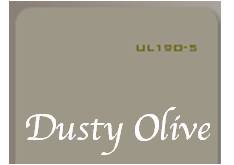
The living room was near impossible for me to capture for some reason. It’s Behr’s Dusty Olive.

The powder room is the same as it was in our townhouse because I loved the color so much that I had to use it somewhere in the house! It is Glidden Slate Green (but it looks very blue in real life)


Want a perfect depiction of how bad my camera skills are? Check out my dining room:

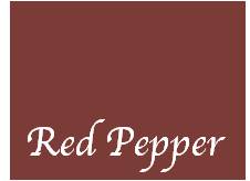
That room is most definitely not bright red. It is Behr’s Red Pepper which looks more like this:
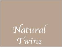
The kitchen connects (via a little doorway) to the dining room. It’s a victim of my husband’s love of tan and is Martha Stewart Natural Twine.


© 2012 Just Us Four. ALL RIGHTS RESERVED.


Any new updates for color that you might be suggesting? Thanks.